 |
Essentials of Biostatistics |
|||||||||||||||||||||||||||||||||||||||||||||||||||
Indian Pediatrics 2000;37: 55-62 |
|||||||||||||||||||||||||||||||||||||||||||||||||||
| 5. Graphical Methods to Summarize Data | |||||||||||||||||||||||||||||||||||||||||||||||||||
| A. Indrayan and L. Satyanarayana* From the Division of Biostatistics and Medical Informatics,
University College of Medical Sciences, Dilshad Garden, Delhi 110 095, India and
*Institute of Cytology and Preventive Oncology, Maulana Azad Medical College Campus, New
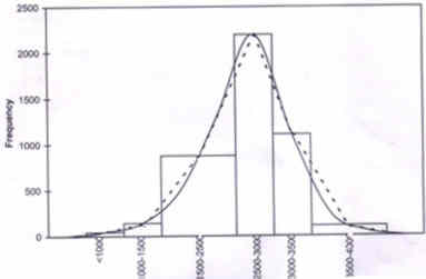
Delhi 110 002, India. The previous article of this series(1) includes the numerical methods to summarize data. For visual display, graphs, diagrams, charts and maps are commonly used. They are generally referred to as "figure" in the literature, though this includes nondata based pictures also such as of a bone or a lesion. Visual display is considered a powerful medium for communica-tion. The impression received from such figures seems to be more vivid and lasts longer than the impression from numeric data. Section 5.1 includes graphs for representing frequency distribution. Graphs for nominal and ordinal data are presented in Section 5.2. Graphs for depicting the relation between two variables of metric type are given in Section 5.3. Some special diagrams used in health and medicine are described in Section 5.4. The last section describes some cautions needed in visual display. 5.1 Representation of Frequency Distribution Strictly speaking, a graph is a figure drawn to a scale. But this is possible only for metric data. The scale could be on horizontal axis or on vertical axis or both. A useful graph is a frequency curve which we discuss below. Histogram-Polygon-Frequency Curve These three types of graphs are used to display a frequency distribution. There exists an interrelation among them. The frequency histo-gram transforms to a polygon and then to a curve. These are shown in Fig. 1 for the data in Table I on birth weight of 5459 newborns.
Fig. 1. Histogram (contiguous bars), polygon (shape enclosed by straight dotted lines) and frequency curve (continuous smooth curve) for data in Table I on birth weights of 5459 newborns Histogram is a set of contiguously drawn bars as shown. The bars are drawn for each group (or interval) of values such that the area is proportional to the frequency in that group. There are six groups of birth weight in Table I. The third and the sixth intervals have width 1000g each while the others have 500g. To adjust this width, the height of the bar for the third and sixth intervals is one-half of the frequency in those intervals respectively. A polygon is a shape enclosed by straight lines. This is drawn by joining mid-points of the bars in the histogram including those with zero frequency at the two ends. A frequency curve is a smooth curve as drawn in Fig. 1. This can be imagined as the shape of the frequency polygon when the number of subjects is extremely large and the width of intervals extremely small. Quite often, such a curve takes a regular shape and is best obtained by means of a mathematical equation. This aspect will be discussed further in a next Article of this series. Table I__ Frequency Distribution of Birth Weights of 5459 Newborns in a Hospital in Delhi.
* Unpublished. Source: Ramji S.
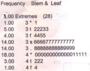
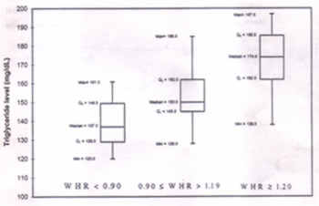
Fig. 2. Stem-and-leaf plot for gestation (weeks) data. Basic information provided by histogram, polygon or curve is the nature of the distribution of the subjects over various values of the variable, i.e., whether they are evenly distributed or that there is a concentration around some value(s), and whether the values are widely scattered or are compact. Thus, these figures are more of an exercise in data exploration than in analysis of data. Stem-and-Leaf Plot A variant of histogram is a stem-and-leaf plot. This shows the actual values as in Fig. 2 for a gestational age data. The first column gives the frequencies and the actual stem-and-leaf plot of the subjects over various values of the variable, i.e., whether they are evenly distributed or that there is a concentration around some value(s), and whether the values are widely scattered or are compact. Thus, these figures are more of an exercise in data exploration than in analysis of data. Stem-and-Leaf Plot A variant of histogram is a stem-and-leaf plot. This shows the actual values as in Fig. 2 for a gestational age data. The first column gives the frequencies and the actual stem-and-leaf plot is in the second column of this figure. The first row of the plot contains an extreme value (values far removed from the rest). Against the frequency column with one, we see that the extreme value is 28 months of gestational age. The first digit in each value is considered "stem" and the second digit "leaf". In Fig. 2, stems 3 and 4 are further divided into five and three parts, respectively. These parts are denoted by asterisk (*), t, f, s and period (.). The asterisk (*) designate leaves 0 and 1; the next, designated by t, is for leaves of 2's and 3's; the third, designated by f, is for 4's and 5's; the fourth, designated by s, is for 6's and 7's; the fifth, designated by a period, is for 8's and 9's. Rows without cases are not represented in the plot. Box-and-Whiskers Plot A diagram considered useful in data exploration is box-and-whiskers plot. A box is made at the value of median with two divisions. The vertical height of the lower division represents first quartile Q1 and of the upper division representing third quartile Q3. (For an explanation of these terms, see our previous Article (1).) The height of the box is the interquartile range. The larger the box, the greater the spread of the observations. The width of the box is arbitrary. Vertical lines are drawn from the minimum value to the lower box and from the upper box upto the maximum value, if they are not outliers. These look like whiskers. Box-and-Whiskers plots for the triglycerides levels (TGL) in different waist-hip ratio (WHR) categories in a sample of healthy adults are shown in Fig. 3. The values of median, Q1 and Q3, as well as the minimum and maximum values are also mentioned. The plot for three WHR groups in Fig. 3 shows that the dispersion of TGL is fairly spread out and is symmetric when WHR � 1.20 but relatively compact and very skewed when 0.90 � WHR � 1.9.
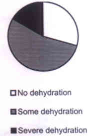
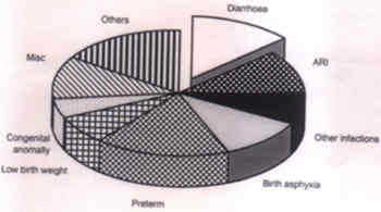
Fig. 3. Box-and-whiskers plots for the triglycerides levels (TGL) in different waist-hip ratio (WHR) categories in a sample of healthy adults. 5.2 Graphs for Nominal and Ordinal Data Histogram, polygon and frequency curve are meant exclusively to display the frequency distribution of a variable on metric scale, preferably continuous. Various other forms can be drawn for other kinds of data. This section discusses two important graphs, namely, pie diagram and bar diagram. Pie Diagram A pie is a circular diagram divided into segments_each segment representing frequency in a category. If the frequency in the kth category is fk out of n then the angle (in degrees) of the corresponding segment is 360fk/n. It is necessary that the categories must be mutually exclusive and exhaustive. The categories should preferably be on nominal or ordinal scale though can be metric also. Figs. 4a and 4b are examples of pie diagrams.
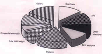
These are based on the data on extent of dehydration reported by Dutta et al.(2). These two pies are drawn to depict two unequal (n) groups of subjects divided into the same categories. Higher number of cases in watery diarrhea group is represented by proportionately larger size of the pie. Such comparability in groups of unequal size is rarely achieved by any other type of diagram. A useful feature of pie is wedging. When the attention is to be specially drawn to one particular category, the segment representing this category is wedged out as shown in Fig. 5a for causes of death in infants(3). The same diagram is "exploded" in Fig. 5b.
Fig. 5a. Causes of infant deaths with category of diarrhea wedged out in a pie diagram. Data source: Hirve and Ganatra(3).
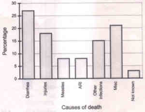
Fig. 5b. Causes of infant deaths depicted as exploded pie for data in fig. 5a. Data source: Hirve and Ganatra(3) Bar Diagrams Bar diagrams are the most common form of representation of data, and indeed very versatile. If the data are mean, rate or ratio from a cross-sectional study then bar may be the only appropriate diagram. It is specially suitable for nominal or ordinal categories. Fig. 6 depicts bar diagram for data on causes of child (1 to 5 years age) deaths of 39 children(3).
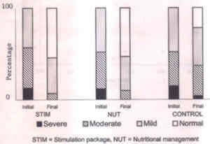
Fig. 6. Bar diagram for causes of child (1 to 5 years age) deaths of 39 children. Data source: Hirve and Ganatra(3) The bar charts differ from histograms since the bars are separated by spaces. Fig. 7 represents a divided bar diagram for stimulation package (STIM), nutritional management (NUT) and control groups before and after intervention in a cohort(4). Each bar represents the total cases in different grades of malnutrition.
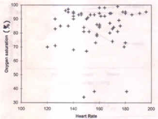
Fig. 7. Divided bar diagram of grades of nutritional status in intervention and control groups. Data source: Elizabeth and Sathy(4). 5.3 Graphs for Relation Between Two Variables Variables such as age, weight, height, cholesterol level, blood pressure, etc., may vary according to the change in the other. Such variation can be depicted by scatter and line diagrams. Scatter Diagram A scatter aims to show the variation in the values of one variable in relation to the other. Simple examples are hemoglobin (g/dl) values in children of different age, and Apgar score of SGA children born to mothers of different Hb level. Different symbols can be used for distinction between male and female subjects. If one variable is dependent on the other then the dependent variable is shown on the vertical axis. This must be a metric variable in all scatter diagrams. Fig. 8 shows a scatter of oxygen saturation (%) with heart rate in asphyxiated newborns at birth.
Fig. 8. Scatter diagram for heart rate and oxygen saturation (%) in asphyxiated newborns at birth. Data source: Ramji S (unpublished data) Line Diagram
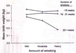
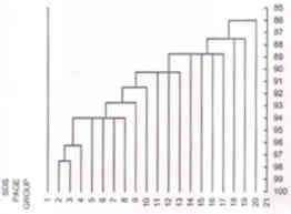
Fig. 9. Line diagrams showing the trend of mean birth weight of newborns by amount of smoking of mother. A line diagram is used to show trend of one variable over the other. Fig. 9 shows the trend of mean birth weight of newborn by amount of smoking of the mother during pregnancy. Three lines are drawn for different duration of smoking. The plotted points are joined by a line. It continues to be called a line diagram even when the representation is by a curve instead of a straight line. Child growth chart is an example of a line diagram. Growth chart is used to monitor the progress of a child by plotting weight at different ages (in months) and comparing the trend with a reference. A growth chart is constructed by plotting different percentile points of weight-for-age of healthy children in a population. This, thus, technically is a line diagram as mentioned earlier but is conventionally called a chart. Growth chart is mainly for longitudinal monitoring of child than for one-time assessment. Important is trend that should follow the same pattern as the reference curve. Any drop or flattening is a sign of lack of thriving. 5.4 Some Special Diagrams in Health and Medicine Among the most common diagrams used by clinicians is the electrocardiogram (ECG). This is a line diagram showing the cardiac electrical activity over time. Time is measured in fraction of seconds. ECG shows variation even in healthy subjects and thus does come under the domain of statistics. But that is too technical for us to discuss in this Article. There are a few other diagrams that are statistical in nature and used typically in health and medicine. The first is a growth chart that we referred in Section 5.3. The diagrams we discuss in this section are dendrogram, epidemic curve and pedigree chart. Dendrogram This is used to show affinity or similarity of one entity with the others. Consider the problem of dividing a fixed number, n, of entities into a small number, K, of homogenous groups with respect to J measurements. This could be like dividing various hemoglobinopathies into groups which are similar within but distinct from others, on the basis of, say, anion HPLC values of HbA2, Hb variant and Hbf, even Hb, RBC, MCV, MCH, etc. The statistical techni-ques used for such division is known as cluster analysis. An outline of this method will be given in a future article of this series. One broad category of cluster methods has hierarchical nature in which similar entities are merged in stages. Dendrogram is a graphical display of the merging taking place at each stage. An example is in Fig. 10 which shows the sequential merging of 20 SDS-PAGE (sodium dode-cylsulphate-polyacrylamide gel elecrop-horesis) groups on the basis of whole cell protein profile in strains of Pseudomonas aeruginosa(5).
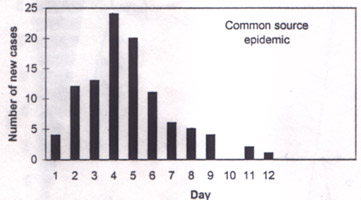
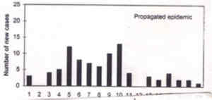
Fig. 10. Dendrogram showing the sequential merging of 20 SDS-PAGE (sodium dodecyl-sulphate - polyacrylamide gel elecrophore-sis) groups on the basis of whole cell protein in strains of Pseudomonas aeruginosa. Source: Khan et al.(5). Epidemic Curve An epidemic of a disease is said to exist when the occurrence is clearly in excess of the usual. The term was originally meant to be used for infectious diseases such as influenza and cholera. In the case of infectious diseases, the number of cases gradually rises, reach to a peak and then starts to decline. The graph showing the number of cases from the beginning to the end of epidemic is called an epidemic curve. Time is plotted on horizontal axis and the number of cases on vertical axis. Even though this generally is a bar diagram but is still interpreted as a curve because it shows trend over time. An infectious disease epidemic in a population that has a common source (such as contaminated water for cholera) has a sharp peak and tapers off gradually. This type of epidemic curve would look like Fig. 11a.
Fig. 11a. Epidemic curve of the common source type. A propagated epidemic results from person-to-person transmission (e.g., of hepatitis A and polio) and the shape of this epidemic curve may be as shown in Fig. 11b.
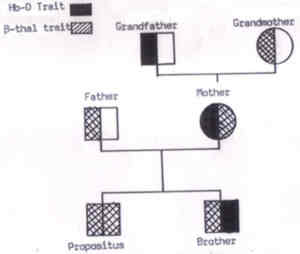
Fig. 11b. Epidemic curve of the propagated type. Pedigree Chart These charts are commonly used to study genetic diseases. One example is in Fig. 12. The patterns in such a chart help to identify that the trait is autosomal dominant or recessive. The dominant traits (e.g., familial hypercholestero-lemia) show a vertical pattern of inheritance (parents and children affected) while the recessive traits (e.g., beta thalassemia) show the horizontal pattern of inheritance (siblings affected). Males are represented by squares and the females by circles. The affected person is denoted by filled up square or circle and the unaffected by hollow square or circle. The two chromosomes can be shown by dividing the square or circle as in Fig. 12. The pedigree charts can also help to investigate the X-linked disorders such as hemophilia A and color blindness.
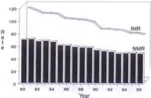
Fig. 12. A classical pedigree chart of a beta-thalassemia child (propositus). Other Diagrams There are a large number of other diagrams that we can not discuss here because of lack of space. Important among them are a mixed 3-D diagram (Fig. 13), lexis diagram, biplot, parto-gram and map.
Fig. 13. A mixed 3D bar and line diagram showing neonatal mortality rates (NMR) and infant mortality rates (IMR) for the years 1980 to 1996. 5.5 Cautions in Visual Display of Data It may be helpful to review the graphical methods and get a clear picture of situations where one diagram is more appropriate than the others (Table II). In addition, also consider the following. When the range of values on y-axis is extremely large then examine whether or not a logarithmic scale would be more appropriate. This scale converts 10 into 1, 100 into 2, 1000 into 3, 10000 into 4, etc. If the regular scale, called linear, is used in this case then some points could become indistinguishably close. However, a cautious interpretation is needed in the case of log scale. Table II__Appropriate Type of Diagram for Various Situations
X The quantities such as frequency, percentage, mean,
rate or ratio can not be used to draw any diagram against any variable that is continuous
and has no categories Cautions * A diagram should not be too complex. Large number of relationships can be shown in one diagram but it is advisable to restrict to not more than two relationships, or not more than 3 variables in one diagram. * Diagram can be made to show steeper or flatter relationship by choosing the scale accordingly. Thus the scale should be appropriately chosen. * A figure displaying all the data points such as frequency distribution and scatter diagram is preferable since it allows readers to draw their own conclusion. However, it some-times is not feasible to show the entire set of data. Only summary statistics such as percentages, rates or averages are shown. In that case, the other diagrams can be used. * Use diagram mostly for exploring the data then to draw conclusions. Since the sample size n is important for conclusions, and since small or big n does not affect the diagram, the conclusion based on diagram alone can be very fallacious. References 1. Indrayan A, Satyanarayana L. Essentials of Biostatistics: 4. Numerical methods to summarize data. Indian Pediatr 1999; 36: 1127-1134. 2. Dutta P, Mitra U, Rasaily R, Bhattacharya SK, Bhattacharya MK, Manna B, et al. Assessing the cause of in-patients pediatric diarrheal deaths: An analysis of hospital records. Indian Pediatr 1995; 32: 313-321. 3. Hirve S, Ganatra B. A prospective cohort study on the survival experience of under five children in rural western India. Indian Pediatr 1997; 34: 995-1001. 4. Elizabeth KE, Sathy N. The role of develop-mental stimulation in nutritional rehabilitation. Indian Pediatr 1997; 34: 681-695. 5. Khan FG, Rattan A, Khan IA, Kalia A. A preliminary study of finger printing of Pseudo-monas aeruginosa by whole cell protein analysis by SDS-PAGE. Indian J Med Res 1996; 104: 342-348. Next article: Reference values in medicine and validity of diagnostic tests. |
|||||||||||||||||||||||||||||||||||||||||||||||||||